Picture info: ISO 100, 36mm, f/2.8, 1/400 sec
Week 51 (7/21/2014 -7/27/2014): PSU Nittnay Lion Statue
Picture taken on 7/27/2014 1:16PM
Photography description
Tradition is something that my friends and I take very serious. Over the years I’ve remained close with many of my High School friends, in part because of our yearly traditions. Among all of our yearly traditions there is one that stands above the rest, the BRAM. The BRAM started 10 years ago by complete accident. Our original plan was to simply have one last weekend getaway to play some golf before we all set out for our Freshman year of college. By the end of the weekend we came up with the concept of the BRAM (standing for Bob, Rob, Anthony, Mike). By the following year we had a trophy, the BRAM Cup, to go along with our tradition, and things have escalated ever since.
At the conclusion of each year’s BRAM, the winner of our 36 hole golf tournament is presented with the BRAM cup in front of the Nittany Lion, which is featured in this week’s post. Just like this statue, we’re confident our tradition will stand the tests of time.
Photography concepts:
Taking pictures of statues is pretty straight forward. Statues don’t move, so the main two decisions you’ll face are how to handle lighting (exposure) and what aperture to shoot with. When it comes to selecting your aperture ask yourself this simple question, do you want to separate the statue from its background? If yes, then shoot the statue with the widest aperture you have. If the statue you’re shooting has a wide depth of field, shoot with a smaller aperture (e.g. f/3.2-f/4) to keep everything in focus. You want to avoid selecting an aperture that will only focus on the front of the statue, unless that’s the look you’re going for. I was able to shoot with f/2.8 and still keep the whole statue in focus.
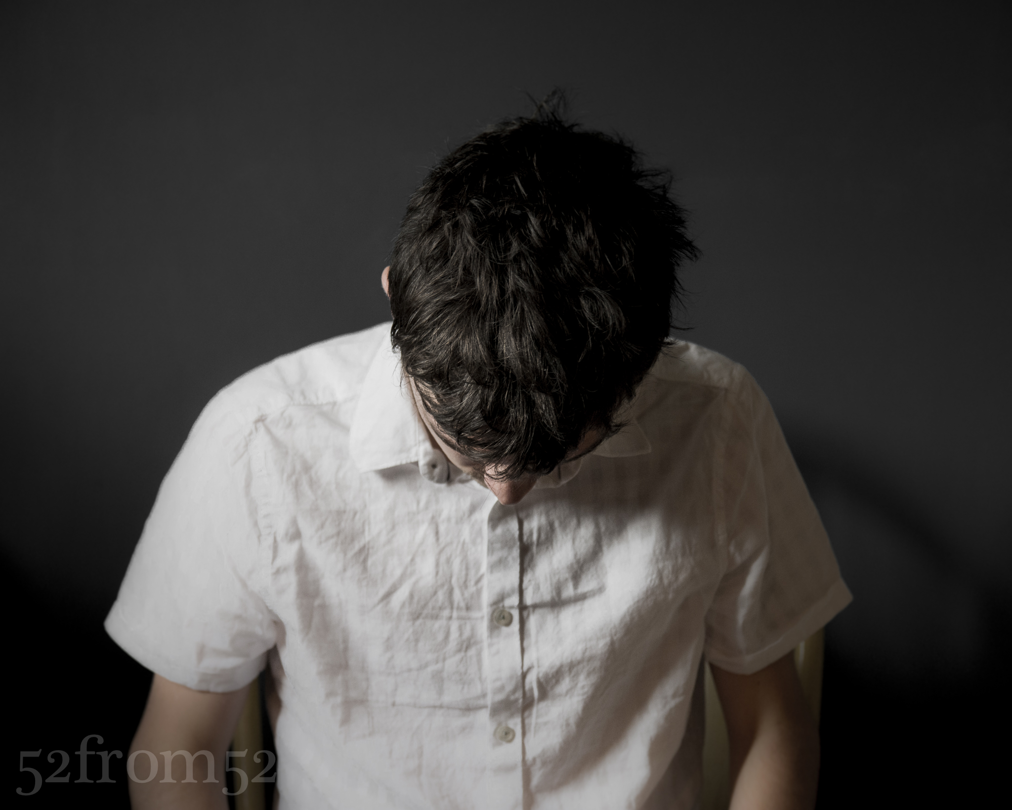
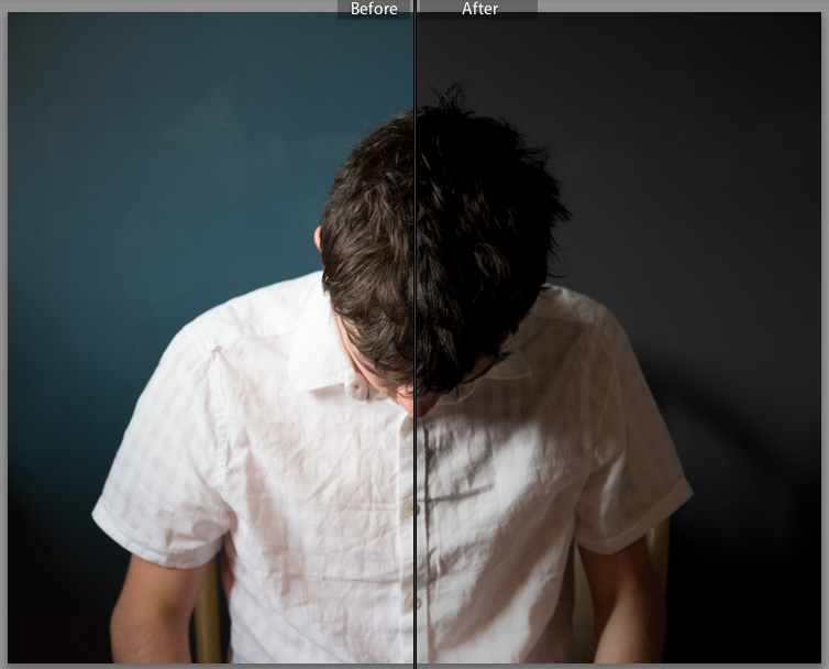
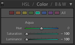
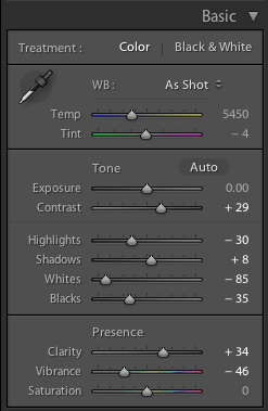
Figuring out the lighting for my picture was simple, mainly because the Nittnay Lion statue was in the shade and thus had nice even lighting. I didn’t have a lot of time while shooting, so I put my camera on aperture priority to make sure I capture an evenly exposed picture. I knew having a well exposed picture would enable me to do whatever editing I wanted after the fact. In Lightroom I decided to emphasize the shadows and bright light spots by dropping the shadows and highlights while boosting the contrast and clarity. These adjustments didn’t create a drastic change, but it was just enough to create the image that I had in mind when taking the picture.
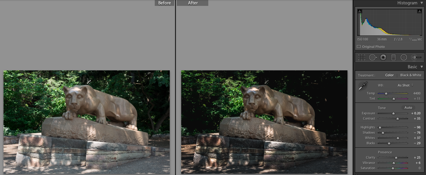
Before and After Edit