Picture info: ISO 100, 36mm, f/13, 1/60 second
Week 52 (7/28/2014 -8/3/2014): Central Park, New York City
Picture taken on 8/2/2014 at 3:26PM
Photograph description:
A year ago when I decided to commit to doing this photoblog my goals were simple, shoot a picture each week, and learn photography. It makes me proud to confidently say that I accomplished both goals, and in doing so accomplished so much more. Hunting down my weekly pictures took me all over New York, New Jersey, Pennsylvania, Florida and countless more places in between. Not only did this photoblog take me to new locations, it also helped introduce me to so many new people. This week was no different, and perhaps it was one of my best experiences yet.
A few week’s ago my brother Ryan mentioned to me that one of his college buddies was looking to propose to his girlfriend. Ryan had shown his friend some of my pictures, as a result, he asked Ryan if I’d be interested in photographing his proposal. Initially I was hesitant to say yes, mainly because I don’t have much experience photographing people and I didn’t want to screw up such a special occasion. After giving it some thought I decided what the heck, I’ll give it a shot.
This week Ryan’s friend reached out to let me know Saturday was the big day, and his location of choice was Central Park. Coincidentally, Central Park was were I hatched the idea for this photoblog so it seemed fitting to get my last picture where it all started.
We all met this past Thursday to discuss the logistics for pulling off our covert mission. Ryan’s friend was a military officer for 5 years so of course he showed up to the meeting with a map in hand and a plan for concealing our identity from his girlfriend. We came up with a solid plan in a matter of minutes, the only thing left was for us to execute!
Our basic plan was to link up with my brother’s friend at the Southeast corner of the park, then follow him and his girlfriend North to the Bethesda Fountain. Once at the fountain, the two would flip some coins into the fountain and make a wish. They would both then walk towards the Bethesda Terrace, and just as they crossed under the inner arches Ryan’s friend would drop to a knee and tell his girlfriend what he wished for, that she would marry him.

Bethesda Fountain
Saturday played out like a movie, we linked up with the couple and trailed them undetected while watching the plan play out. Once it came time for Ryan’s friend to pop the question, I moved in for the shot. As I crouched down to take the picture something new happened, my adrenaline pumped? It was part nerves, part excitement but absolutely a new experience for me while taking pictures. After taking the pictures my brother and I congratulated the newly engaged couple, took some more posed picture, then were on our way.
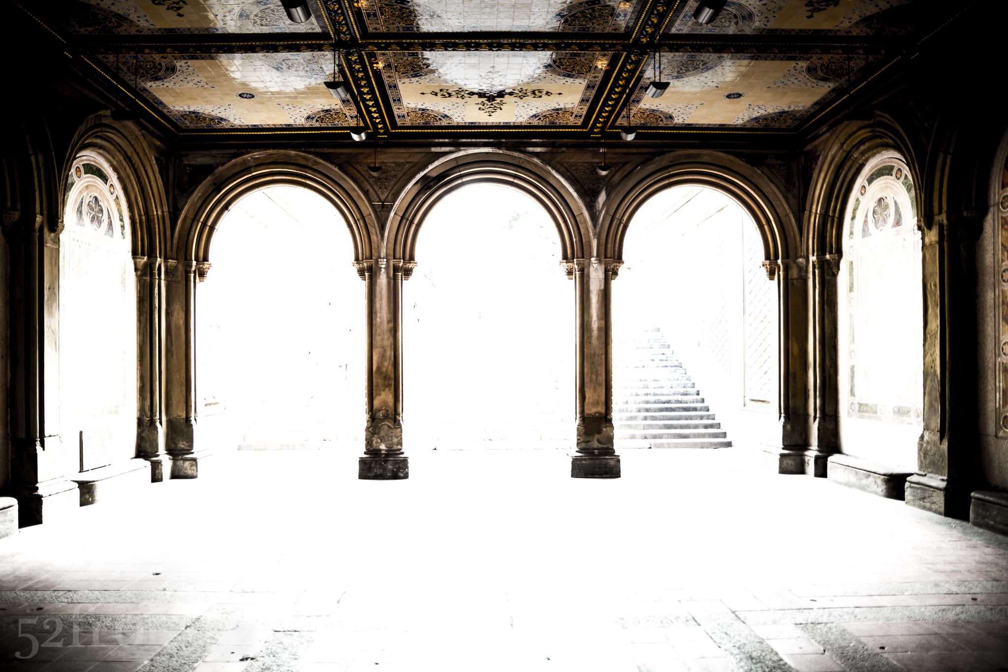
Bethesda Terrace: Proposal Location
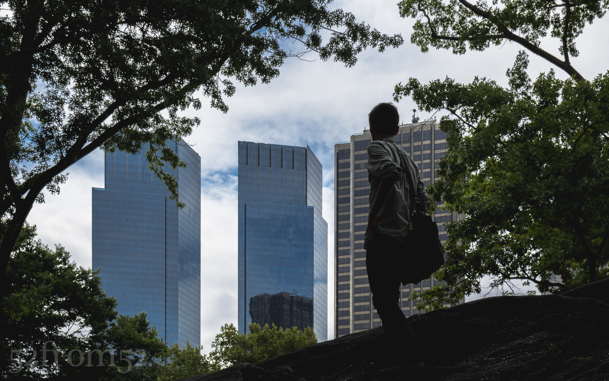
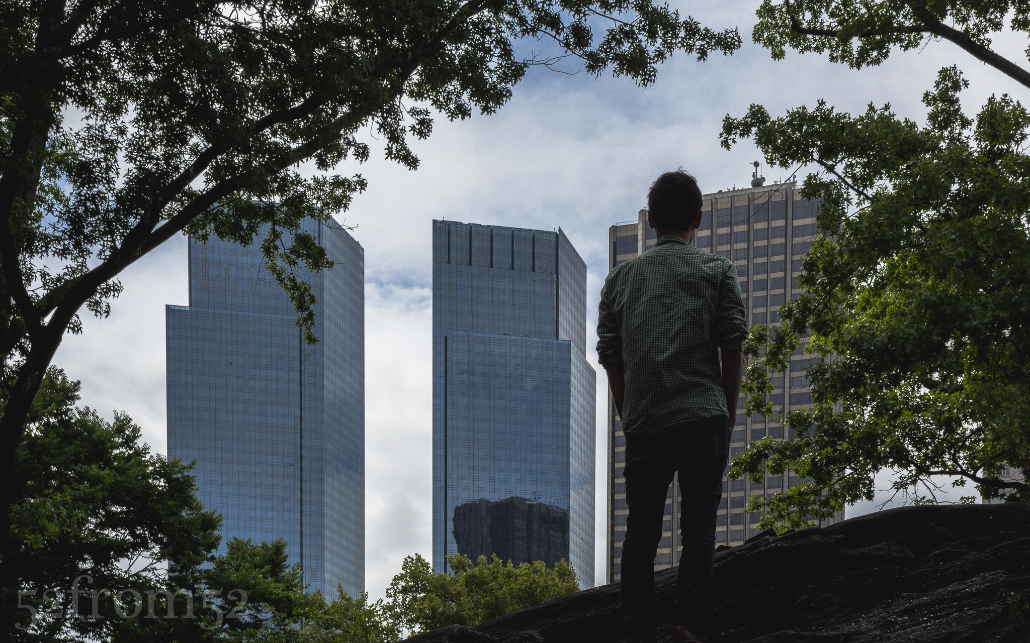
As Ryan and I worked our way south towards Columbus circle we came across some large rocks that jutted out of the ground. Ryan decided to climb on top of one of the rocks to get a better vantage point. Once Ryan was at the top of the rocks I directed him to look out towards the city skyline so I could take a picture. As Ryan turned towards the skyline, I saw it, the perfect shot, the perfect picture to close out my 52 week series.
You’re probably asking, why was the picture so perfect and what did I see? It all happened so fast that it’s hard to describe, but as I took the picture I realized Ryan was inadvertently acting out how I was feeling. Ryan climbing the rock represented me accomplishing my goal of completing my 52 week series. Ryan turning around towards the city represented the idea that although I just accomplished my goal, in doing so it revealed a much bigger world full of new challenges just ahead. My unique experience while taking the proposal pictures, along with the previous 52 weeks made me realize that this is not the end of my photography journey. Simply put, this was chapter one, and now it’s time for the next chapter.
Photography Concepts:
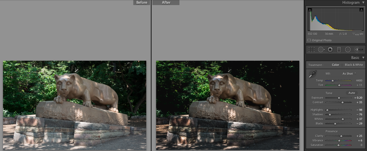
If someone asked me, “what do you think are the most valuable lessons that you learned of the past 52 weeks”, my answer would have to be my understanding of exposure and composition. Understanding exposure enables you to take pictures that capture scenes as you see them. Highlights, shadows, blacks and whites are the building blocks of a good exposure, they’re also what makes up a histogram. Without explaining the histogram, I’ll show you how taping into the power of these attributes unlocks endless creative freedom. If however you want to learn about the histogram, check out the link below.
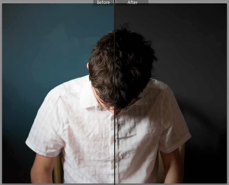
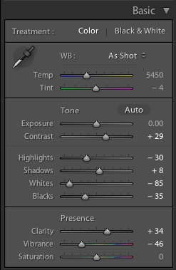
Using this week’s picture as my example, in camera I wasn’t able to capture the full spectrum of highlights and shadows. What I’ve learned to do in this situation is to take an evenly exposed picture in camera, then rework the highlights and shadows in lightroom. Below is a split screen before and after of my picture. In order to bring back the blue and detail of the clouds I had to almost completely drop the highlights to -90. To compensate for dropping the highlights I raised my whites, this made sure I didn’t totally darken my image. Next I lowered my shadows and blacks to make the trees and rocks darker, and emphasise the contrast between the city and the view inside the park. Knowing the effect of highlights, shadows, blacks and whites is what gave me the knowledge to mold the image into exactly what I wanted.
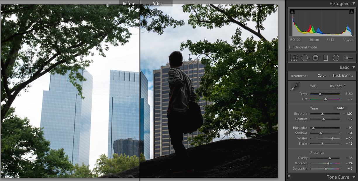
Before and After Lightroom Edit
Just like with exposure, understanding composition enables you to capture a scene and pass on what you see to a viewer. As I talked about in the photograph description, the site of Ryan up on the rock was very symbolic to me. Much of what created the symbolism was the composition of the picture. Ryan’s position in the image, and orientation of his body were the two keys to creating the powerful image. As I’ve talked about countless times over the past 52 weeks, the rule of thirds is what guides most of my composition decisions. I’ve practiced the rule of thirds so much that I lined Ryan up on intersection point between the right and middle thirds basically without even thinking. Next, when I told Ryan to turn and face the buildings, I shot my picture before he completely turned and presented me with his whole back. To me , this half turned orientation gives the feeling that he just got to the top and is just looking out for the first time. As a comparison, I took a picture of Ryan with his back completely turned to me, and for me that seemed like the body language of someone that was deep in thought. He might have been standing on that rock for minutes, hours or even days? His body orientation doesn’t show motion so it seemed boring. These are just a few examples of things to think about when you’re lining up your subjects.
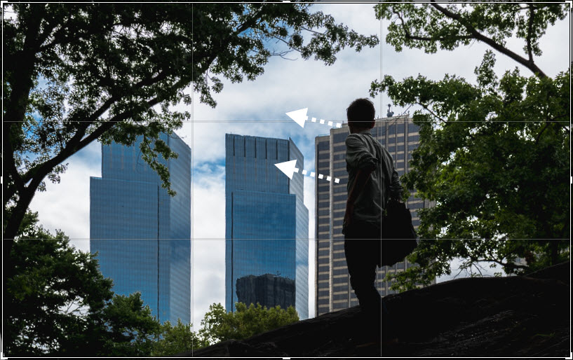
Rule of Thirds Applied
Now that I explained some of the ways that I use exposure and composition to get creative, it’s your turn. I’ve spent the past 52 weeks showing you my perspective, perhaps it’s time you get out there and show me yours. Start a blog, post more actively on Instagram, shoot YouTube videos explaining how and why you take pictures. Do whatever it takes to share your creativity and I guarantee, you won’t regret it, I know that I don’t.
Alternate view: Ryan’s back turned
Links:
Histogram Article – Click here